Uplands
QTR Wine
✹ ✹ ✹
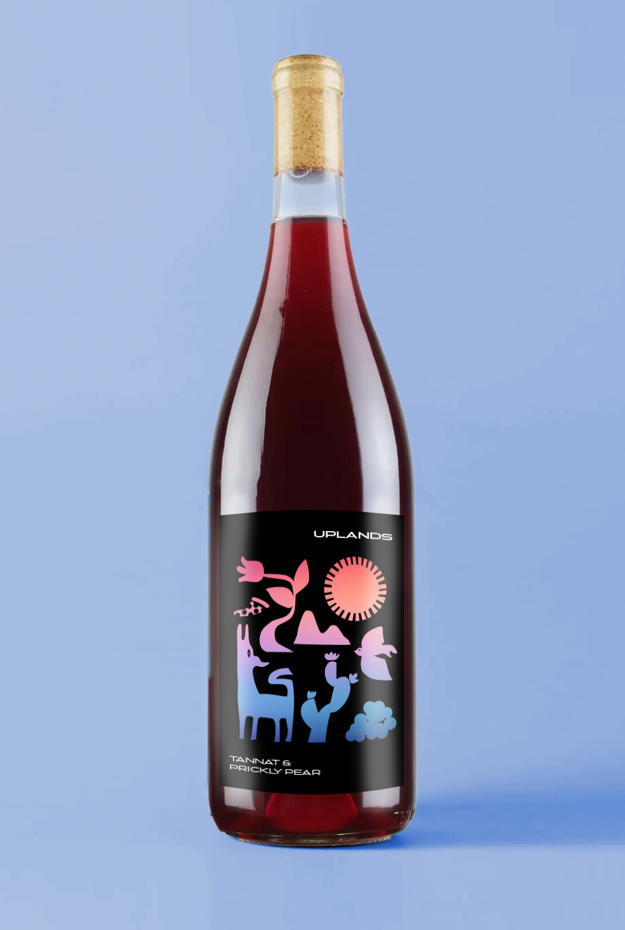
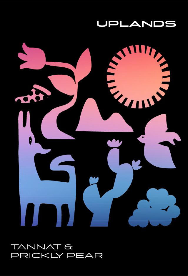
Rob Easter of Workhorse Rye asked designer Marian Shelley Acuña and I to develop and design a vertical of brands under his soon-to-launch wine company QTR Wines. Applying the same thoughtful (and exacting) philosophy behind his distillates brand, Rob was using all organic and regeneratively-grown fruit and botanicals from the southern Arizona region.
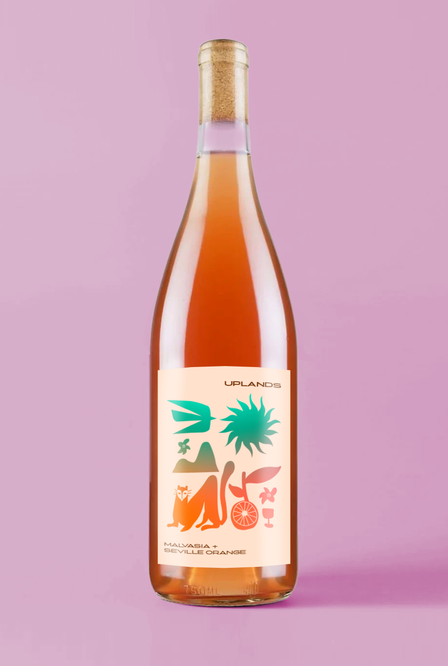
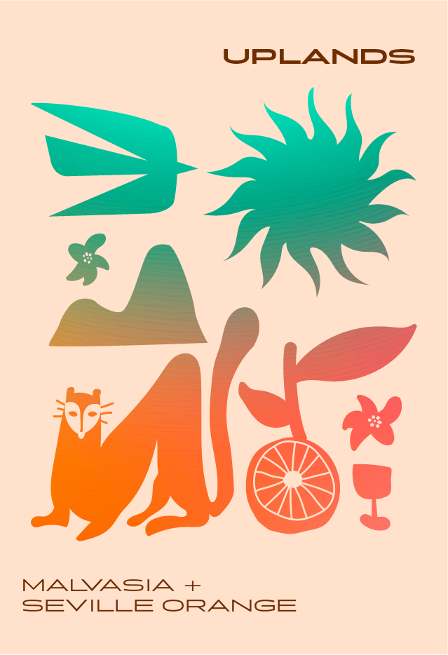
For his natural wine brand, we chose the name “Uplands” which directly spoke to the Arizona Upland biome of the Sonoran Desert from which all his wonderful inputs come from. Visually, we wanted to evoke images of the landscape (see: coati), as well as some lighter-hearted nods the vibe of the wine itself (see: pizza). The backfill is a spectrum meant to evoke the desert sunset and dusk.
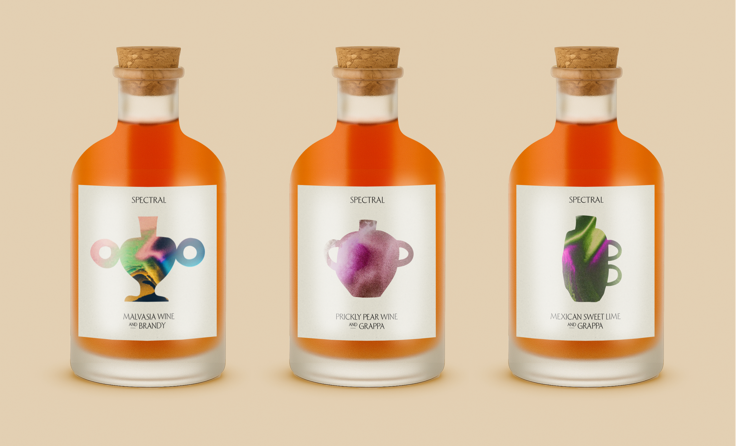
For Rob’s fortified wines, we aligned on the name “Spectral,” which pointed to the range of flavors possible when blending. Visually, we aligned on something clean and elegant, with simple shapes that pointed toward ancient vessels, a nod to lost alchemical arts and elixirs.